

"Your hands already know."
An end-to-end somatic wellness system from hardware sensor to mobile app, designed to help users catch hidden stress before it becomes burnout.

ABOUT
Orbit is a pressure-sensing smart squeeze ball paired with a mobile app, an end-to-end somatic wellness system that turns the grip-tension you're not even aware of into something you can see, hear, and feel. Built for high-functioning, anxious professionals who've lost touch with their own stress signals, it captures raw grip data through touch, light, and sound, and translates it into a warm, narrative-driven reflection instead of a cold metric.
I owned the full process solo, using AI(Claude Code) as a working method at every stage, from synthesizing 700+ raw research data points, through AI-assisted visual concepting, to a hi-fi Figma prototype paired with a functional pressure-sensing hardware companion. The core design challenge was building this "somatic feedback loop": not just deciding what data to show, but how to make raw physical tension feel like it's being understood, not measured. AI-accelerated iteration let me move through concept, visual, and prototype cycles fast enough to test that feeling early and often, rather than treating it as a launch-day feature.
Timeline
Aug 2025 – May 2026, 9 months
Task
Secondary & Primary Research
Hardware Interaction & Functionality Design
Design System
Hi-Fi Prototyping
Usability Testing (2 rounds)
AI-Assisted Rapid Prototyping
Team
Wenliang Huang
THE PROBLEM
We live in the age of the "Quantified Self", tracking steps, calories, and heart rate with clinical precision. Yet 74% of people only realize they're stressed after a headache, a burnout, or a body that's already given out. Their minds say "I'm fine." Their bodies have been storing the truth the whole time.
This is the Mind-Body Gap: emotional states aren't a single number, but most wellness tools flatten them into one anyway, telling you that something changed, never what you're feeling or why. High-functioning people keep trusting metrics that cause more anxiety than clarity, while the tension underneath goes unheard until it becomes a crisis.
RESEARCH → AI INTEGRATION POINT #1
8
Shadowing observations
216
Survey responses
28
Interviews
1
Day-in-the-life diary
700+
Raw data points
700+ raw data points from surveys and interviews were distilled through Affinity Mapping into
108 Themes
↓
58 Key Insights
↓
4 Opportunity Areas
↓
3 HMWs
The "North Star" for the entire design phase.
I treated Claude and Google AI Studio as research partners, using them to cluster raw data, surface recurring patterns, and organize themes at a speed manual synthesis couldn't match, compressing weeks of analysis into days. Every AI-assisted cluster was then manually reviewed and validated against the original transcripts, ensuring the insights stayed grounded in what participants actually said.
This is what AI fluency looks like in practice for me: not offloading judgment to a tool, but using it to accelerate the path from raw data to actionable insight, so more time goes into interpreting what the data means, not organizing it.
KEY INSIGHT → DESIGN PRINCIPLE
"Your hands know your mood before your mind does."
When we feel anxious or angry, we subconsciously clench our jaw or grip something tighter, the body reacts before the brain has a word for what it's feeling. This isn't a metaphor: the hands carry one of the highest densities of nerve endings in the human body, making grip pressure one of the most immediate, honest signals of subconscious tension we have.
This insight became the project's design principle: if the body already knows before the mind catches up, then the interface shouldn't ask users to think their way into self-awareness, it should let them feel it. That's why Orbit is built around touch and grip, not a screen you stare at or a score you read. The hand becomes the input, and the sensation of holding something becomes the interaction itself.
THE PRODUCT
Orbit is a two-part system built around one idea: the physical ball does the sensing, the app does the reflecting.
Brand Identity
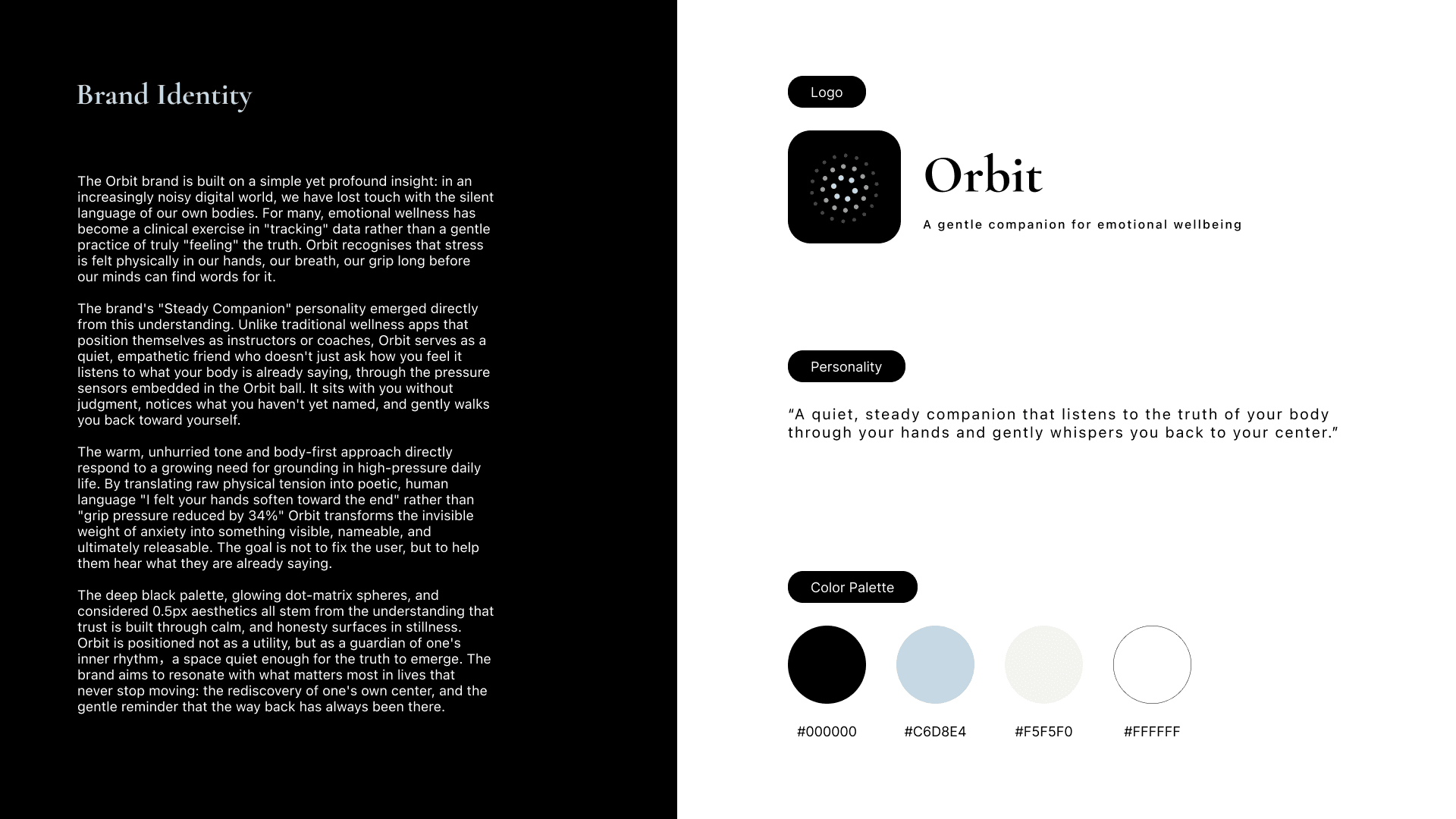
Orbit's personality is a "steady companion," not an instructor. Where wellness apps coach and measure, Orbit listens, through the grip, without judgment, and translates raw physical tension into warm, human language: not "grip pressure reduced by 34%," but "I felt your hands soften toward the end." The deep black palette and glowing, dot-matrix spheres carry that same restraint: calm enough for the truth to surface on its own.
Design System
A quiet, editorial visual language, serif headlines and muted blues to keep the tone calm rather than clinical, so the interface never competes with what the user is actually feeling.

The Orbit Ball
Grip sensing + proactive nudge: Pressure sensors read grip intensity in real time and prompt you at the right moment, instead of waiting for you to open an app.
Bio-responsive glow: The light doesn't just flash a notification; it breathes in sync with your actual grip pressure, moment to moment — so the object itself feels like it's moving with you, not just displaying data at you.
Offline ritual: No app required to use it. Holding the ball is itself the act of checking in, logged and synced whenever you reconnect.


The App
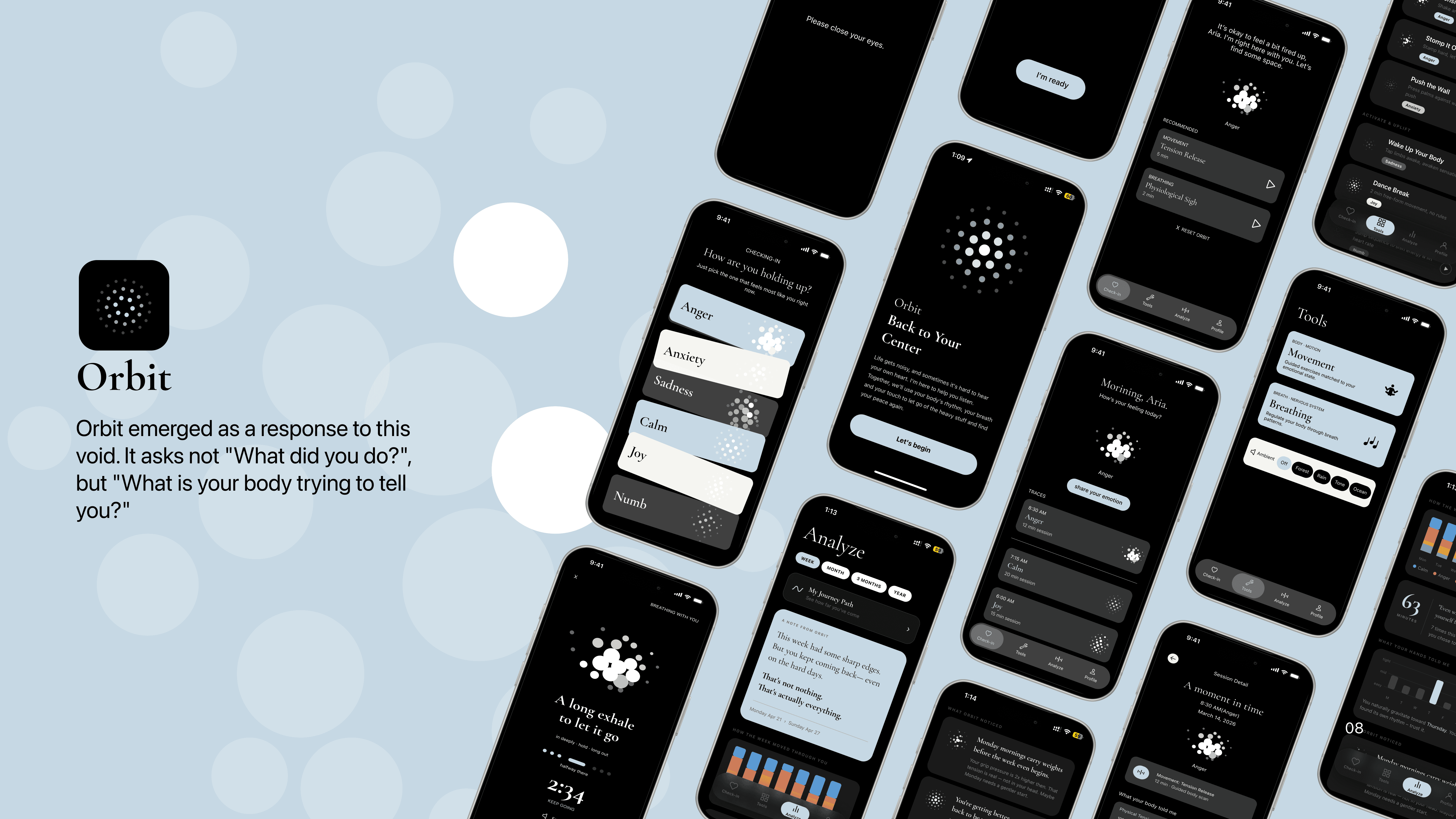
The app is structured around four core flows: Check-in, Tools, Trace, and Profile, each accessible from a single entry point, so no task ever requires backtracking through unrelated screens.
Structured around three tasks, not three data types:
Check-in (log how you're feeling),
Tools (guided breathing and body-release exercises),
Trace (analyze a week of your emotional patterns, told back to you as a short reflection, not a chart).


Check- in
A quick, honest check-in, pick the feeling closest to how you're holding up, no forced positivity, no data to interpret.


Tools
Emotion-matched exercises, Movement and Breathing, that turn a logged feeling into a physical action, not just a label.


Trace
A week reflected back as sentences, not statistics. Orbit notices the pattern so you don't have to read a chart to feel it.
Where hardware and software meet

1. Sensed — Grip sensors read physical tension in real time.
2. Measured — The curve compresses into one signal: 84% at the 3rd minute.
3. Interpreted — The app reads the pattern, not just the number: "Overwhelmed."
4. Reflected — The reading becomes a note, not a score: "I can tell you were holding on to a lot of stress today..."
The ball's grip data doesn't just sit in a log, it becomes the evidence behind what the app tells you.
In this session, a spike in physical tension became more than a number on a graph: the app read the pattern as "Overwhelmed" and reflected it back in a note instead of a score.
The sensation the user never consciously registered becomes something she can actually sit with, read, feel understood by, and move on from.
DESIGNING AN AI-ASSISTED REFELCTION LAYER
AI showed up early in this project too, clustering 700+ raw research points into themes before any interface was designed. But the harder problem sat further downstream: not organizing data, but deciding what to do with it once it reached a stressed user staring at a chart. So instead of a dashboard, I designed "Traces": a feature that reframes a user's week as a personal, letter-style narrative instead of a set of scores.
This is where I designed for AI-assisted decision-making, not just AI-generated content. The system takes two inputs, what the user says they feel, and what their grip actually revealed and synthesizes them into one short, empathetic reflection that:
Acknowledges effort
Surfaces a pattern ("your Monday mornings run tighter than your Fridays")
Points toward one small next step
The goal was moving users from data to a decision, not "here's your score," but "here's what this means, and here's what might help."
PROTOTYPING WITH AI, NOT JUST DESIGNING FOR IT
Beyond the interface, I used Claude Code and Antigravity to prototype the system's actual functionality, generating the React/JavaScript and implementing Web Bluetooth logic to pull real-time sensor data from the physical device into the app.
That meant I wasn't mocking up what "grip-to-emotion-glow" might look like in Figma. I could hold the ball, squeeze it, and watch the interface respond live.
Every AI-generated output, from code to visual assets , was reviewed, debugged, and integrated by hand. AI accelerated iteration speed, not design judgment.

VALIDATION
Every design decision in Orbit's second iteration was validated through structured usability testing, not assumption.
Round 1 · Moderated testing, 14 participants


Two rounds of moderated usability testing were conducted across three user segments:
Hidden Tension, Metric-Aware, and Somatic-Curious.
Round 1 validated the core direction: the conversational tone, the no-score philosophy, and the emotional check-in flow all landed well. But a good usability score doesn't always mean a trusted product, the gap between how easy Orbit was to use and how much participants trusted it traced back to four specific issues.
SUS score
83.2
Excellent range
NPS
14.29
Far lower than usability suggested
Facial recognition on by default
8/14 felt surveilled
Switched to manual, opt-in flow
→
"Analyze" felt clinical
Caused hesitation before entry
Renamed to something warmer
→
"Your Path" lacked hierarchy
6/14 scrolled past it
Given a stronger visual entry point
→
Only 6 emotion categories
7/14 couldn't name their feeling
Added intensity-and-context screen
→
Round 2 · Remote , 14 partitestingcipants
Round 2 moved beyond fixing what Round 1 surfaced, it tested how those fixes actually performed under real tasks, this time through unmoderated remote testing to remove the bias of testing with people who already knew the product.
Felt easy to use
4.23/5
Would use it weekly
3.46/5
Task completion and satisfaction split in a telling way, usability wasn't the same as habit-forming.

That gap became the brief for the next iteration: fixes ranging from quick wins, like adding a completion-confirmation screen after mood logging, or a one-line explanation for the camera-based emotion detection to deeper systemic work, like rebalancing the visual hierarchy across the first screen.
This before/after loop across two rounds, not intuition, shaped every subsequent design decision.
Add a completion confirmation screen after mood tracking
Before
After

A completion-confirmation screen closes the moment of doubt after logging a mood, users no longer have to wonder if it registered.
Add a one-line explanation to the camera emotion detection feature
Before
After

A one-line explanation in front of the camera feature turns a moment of unease into one of informed choice.
IMPACT & FUTURE VISION
For you. Orbit doesn't ask you to track more. It asks you to notice what your body has been trying to tell you the whole time, no scores, no judgment, just space to trust yourself again.
For companies and care providers. A real wellness benefit that catches burnout before it happens, and gives care providers a window dashboards can't offer: what a person's body was actually holding between check-in.
For the world. A shift in what "health tech" even means, from a cold tracker measuring you, to something closer to a warm friend witnessing you.
WHAT'S NEXT
Touch stays the primary channel, that was the whole point, but future iterations could layer in optional inputs like voice or expression for users who want more ways in, without ever making disclosure mandatory. And the AI narrative engine has room to grow: from a weekly summary you read after the fact, to something closer to real-time companionship, present in the moment tension happens, not just reflecting on it once the week is over.