
Green & Affordable
Thermostat + App

About
In this design project for the Google Nest thermostat, I engineered a dual-platform thermostat system tailored for the "Green & Affordable" segment. Moving from initial hand-drawn wireflows to high-fidelity Figma prototypes, I led the development of a cohesive visual language that balances sustainability with accessibility. My primary focus was on designing the Energy Mode interface, transforming complex HVAC data into intuitive manual adjustments and real-time energy feedback to ensure a consistent experience across both the physical device and the mobile application.
Impact
The redesigned system successfully bridged the gap between automated energy saving and manual user control. Usability testing showed that the new interface significantly improved the clarity of energy feedback, allowing users to make more informed adjustments without the confusion typical of current thermostats. By streamlining the "Energy Mode" interaction, the design lowered the barrier to sustainable home management, directly empowering energy-conscious users to optimize their HVAC usage. This cohesive approach not only enhanced the product's accessibility but also reinforced the Google Nest brand’s commitment to environmental sustainability.
Timeline
Jan 2026 - Mar 2026, 2 month
Task
Research
Design System
Prototyping
User Testing
Iteration
Team
Wenliang Huang
Mercury
Chang Chen
Songze Wu
Background
Google Nest: Redefining Sustainability
Google Nest is a global leader in smart home technology, dedicated to building a more energy-efficient future. To better support the "Green & Affordable" market initiative, we initiated a dual-platform project to redefine the thermostat experience. This design focuses on bridging the gap between high-level energy-saving automation and intuitive, accessible user control, ensuring that sustainable living is reachable for every household.

Challenge
The Sustainability Gap: Translating "Invisible Energy" into "Actionable Savings."
The biggest hurdle for the Green & Affordable segment isn't a lack of will, it's a lack of clarity. Users want to be eco-friendly, but traditional thermostats hide energy data behind complex menus, making it impossible to see the direct link between a temperature setting and a utility bill. Our challenge was to transform the Energy Usage section from a static spreadsheet into a high-impact financial and environmental dashboard.
Goal
Develop a transparent energy ecosystem that empowers users to reach cost-saving goals without compromising home comfort.

Showcase
Feature 1
Redefining the Energy Mode for frictionless home sustainability
I find it crucial to create an approachable climate management experience, where the balance between comfort and savings is not just a hidden setting, but a visual priority that empowers users to make greener choices without cognitive friction.

Energy Mode
Feature 2
Engineering a flexible scheduling interface for long-term climate efficiency
I find it essential to bridge the gap between complex automation and manual user control. By replacing rigid input methods with intuitive, gesture-based adjustments, sliding for time and swiping for temperature, we transformed a high-friction 3-minute task into a fluid, visual experience that encourages users to maintain sustainable home habits.

Concise Schedule
Feature 3
Implementing proactive climate intelligence to guide sustainable decision-making
I find it crucial to foster a transparent "dialogue" between the smart system and the user. Rather than simply restricting control, we designed an intelligent feedback loop that alerts users when their settings exceed eco-friendly ranges. This ensures that users remain informed of the financial and environmental impact of their choices in real-time, balancing immediate comfort with long-term energy goals through automated, smart resets.

Climate Intelligence
User Testing
Validating our design direction & concept testing
We tested our concept with our individually. Observing their reaction and write down their positive reaction, skepticism, negative reaction, and desire in a compiled table.
Zoom recording for user testing session
Google Doc for user testing plan


Usability testing report
Testing Results
8+ Session, with overall positive feedback and foreseen use cases.
Recommendation 1:
Implement Immediate Visual Feedback
Recommendation 2:
Replace Sliders with Discrete Input Controls
Recommendation 3:
Clarify Hardware Affordances and Menu Hierarchy
Recommendation 4:
Simplify Information Architecture for Schedule Recurring
Testing Results
Tackling confusions from user testing session
After the testing session, we did the iteration based on our received feedback.

Before

After
Adjust the hierarchy and information architecture of home page.
Change the drag visual expression of changing the temperature and indoor temperature.
Add the visualization to the status of energy mode.
Add the power button.
Adjust the navigation bar.

Before

After
Adjust the visualization expression of dragging the temp and time.

Before
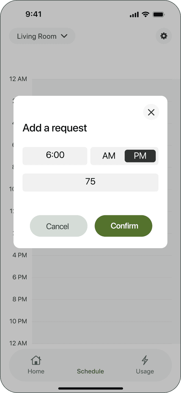
After
Adjust the request box of changing schedule temp and time.
Impact
The story does nor end here...
Shifting from "Passive Consumption" to "Active Stewardship"
By transforming invisible kWh data into a tangible "Savings Narrative," we did more than just redesign an interface, we changed user behavior. With a guaranteed 10% reduction in heating bills and visible savings of $105 per winter, users are no longer passive consumers of energy; they are empowered stewards of their own household economy and the planet.
Decoupling "Sustainability" from "High Cost"
Our design proves that going "Green" can be the most affordable choice. By scaling this efficiency across the 57 million U.S. households using electric heating, the potential impact is a staggering $6 Billion in annual savings and a CO2 reduction equivalent to 11 NYC-sized forests. We’ve demonstrated that a smart thermostat is not a luxury, but a vital tool for social and environmental equity.
Takeaways
Something you can’t learn in a class
Minimalism is a liability without discoverability
In design school, we are taught that "less is more." However, this project provided a reality check: a 56 SUS score proved that stripping away UI elements can sabotage the user’s mission. I learned that "Smart" devices become a cognitive burden if the primary navigation feels like a guessing game. True minimalism isn't about removing buttons; it's about providing the right signifiers to ensure the "Hidden Logic" is never hidden from the user.
Bridging the gap between "Raw Data" and "User Motivation"
I realized that raw energy data (kWh) is a language users don't speak. To truly design for the "Green & Affordable" segment, we had to move beyond aesthetics and focus on behavioral economics. Translating complex HVAC metrics into a "Savings Narrative" ($546 saved, 11 forests grown) taught me that UX is the art of translation, turning invisible energy into tangible financial and emotional rewards.
Navigating the synergy of Hardware-Software constraints
Designing for a physical rotary dial is fundamentally different from a mobile touchscreen. This project taught me to anticipate "Affordance Failures" like users instinctively tapping a non-touch screen. Coordinating a consistent visual language across dual platforms (Hardware + App) required me to think beyond the frame and account for the tactile, physical reality of how people interact with their homes.