

From Manual Verification to AI-Reviewed Trust
Redesigning identity workflows across 10+ fragmented FINRA systems.

ROLE
Researcher & UX Designer
Synthesized 700+ fragmented data points
Optimized complex regulatory workflows
Redesigned unified login & dashboard
Facilitated cross-functional alignment
TEAM
Researcher & UX Designer (ME)
LED
Research Team SME Interviews
WORKED WITH
FINRA UX & Product Team
SCADpro Cross-functional Team
TOOLS
Figma, Vibe Coding
DURATION
3 months
IMPACT I BROUGHT
Launched in Jan 2026
700+ data points into actionable insights
40% reduction in navigation complexity
100% alignment with security protocols
OVERVIEW
FINRA is the self-regulatory organization overseeing the U.S. securities industry. Working with SCADpro, I served as researcher & UX designer on a cross-functional team, leading the research phase and driving the redesign of FINRA's fragmented digital ecosystem, from 10 disconnected systems into one unified dashboard.
The root issue: these tools were built around internal permission structures, not around what users actually needed to accomplish. As a result, firms lost an estimated $100 million annually just searching for information across systems.
RESEARCH PROCESS
PRRMARY RESEARCH
90-minute group interview with 3 FINRA SMEs
↓
revealed Expert Bias
↓
Internal access was designed around job titles, but users actually navigate by task. ("The ideal is one entry point, and entitlements and authentication will dictate what they're served.")
SECONDARY RESEARCH
Analyzed sentiment across Reddit and compliance forums + mapped the user journey
↓
surfaced a recurring emotional arc: Exam Passed
↓
Login Failure
↓
Information Vacuum, revealing that users often mistook system fragmentation for account errors.
THIRD-PARTY RESEARCH
Applied the Jobs to Be Done (JTBD) framework to FINRA.org
↓
identified four core user needs: Career Advancement, Investment Guidance, Regulatory Interpretation, and Compliance Monitoring.
700+ raw data points
110 groups
27 themes
Raw research notes and observations
Clustered by affinity mapping
Patterns across groups
10 insights
Distilled, actionable findings
6 core problems
CHALLENGE — 6 PROBLEMS WE FOUND
01: Anxiety without a safety net
Complex regulatory tasks lack clear guidance and accountable points of contact, leaving users uncertain whether they're doing something correctly — or who to ask if they're not.
02: Navigation without hierarchy
The current information architecture is inconsistent and lacks clear hierarchy, making even simple tasks harder to locate than they should be.
03: Systems built around titles, not tasks
Enterprise systems are structured around internal roles rather than the tasks users are actually trying to complete, forcing people to manually track actions and updates across multiple platforms and accounts.
04: Redundancy across the ecosystem
Overlapping content, duplicate features, and inconsistent visual patterns across FINRA's platforms erode trust and slow users down.
05: Jargon as a wall
Inconsistent terminology and unexplained industry language leave users without enough context to complete tasks confidently, compounding confusion at every step.
06: Login as the first point of failure
A fragmented authentication system, shaped by legitimate security constraints, still leaves users with limited visibility into which accounts they can access and why.
DESIGN PRINCIPLES
Through stakeholder interviews and the synthesis of complex regulatory workflows, we established three core principles to guide the transformation of FINRA's digital ecosystem.
Principle #1
Unified integration
Bring FINRA's disconnected systems into one connected home. By removing silos between platforms, the experience feels like a single, cohesive tool, not a collection of separate websites.
Principle #2
Scalable growth
Build a flexible foundation that can grow with FINRA's evolving ecosystem. The system is structured to absorb new features and future sub-systems without becoming cluttered or overwhelming.
Principle #3
Task-aware adaptation
Design a dashboard that responds to what the user is trying to do, not who they're formally labeled as. Rather than showing everything to everyone, the system adapts to each user's active tasks, cutting out the noise so they can focus on what needs to get done.
DESIGN DIRECTION
The Lobby Concept
Instead of asking "who are you?", the redesigned experience asks "what are you trying to do today?" and lets the system determine identity and access from there.
Rather than routing users through separate logins for FinPro, Gateway, Classic CRD, and beyond, the Lobby Concept introduces a single entry point that recognizes a user's full set of permissions the moment they authenticate then surfaces only what's relevant to their active task.
How it works
1. Task-first login
The login screen doesn't ask users to identify their role. It asks what they want to accomplish, presenting five common task categories drawn directly from research.
2. Smart account pre-matching
Once a task is selected, the system automatically matches the user to their relevant account profiles, surfacing exactly which permissions apply, before a single credential is entered.
3. Integrated profile selection
If a user holds multiple roles (common among small-firm staff, who make up 80% of FINRA's user base), they see clear profile cards showing pending items under each identity, no guessing which login to use.
4. Secure identity verification
Email and one-time code confirm identity. Once verified, the user lands in a single aggregated view spanning every account tied to that identity, not a separate portal per system.
This reframes authentication from a gatekeeping step into a matching step: the system does the work of figuring out who the user is and what they're entitled to, so the user doesn't have to.
Select a task
"What to do"
Account pre-match
System finds relevant profiles
Profile selection
Cards show pending items
Identity verification
Email + one-time code
Aggregated dashboard
One view across every linked account
One login, matched to the task, not routed through separate systems
ITERATION 1
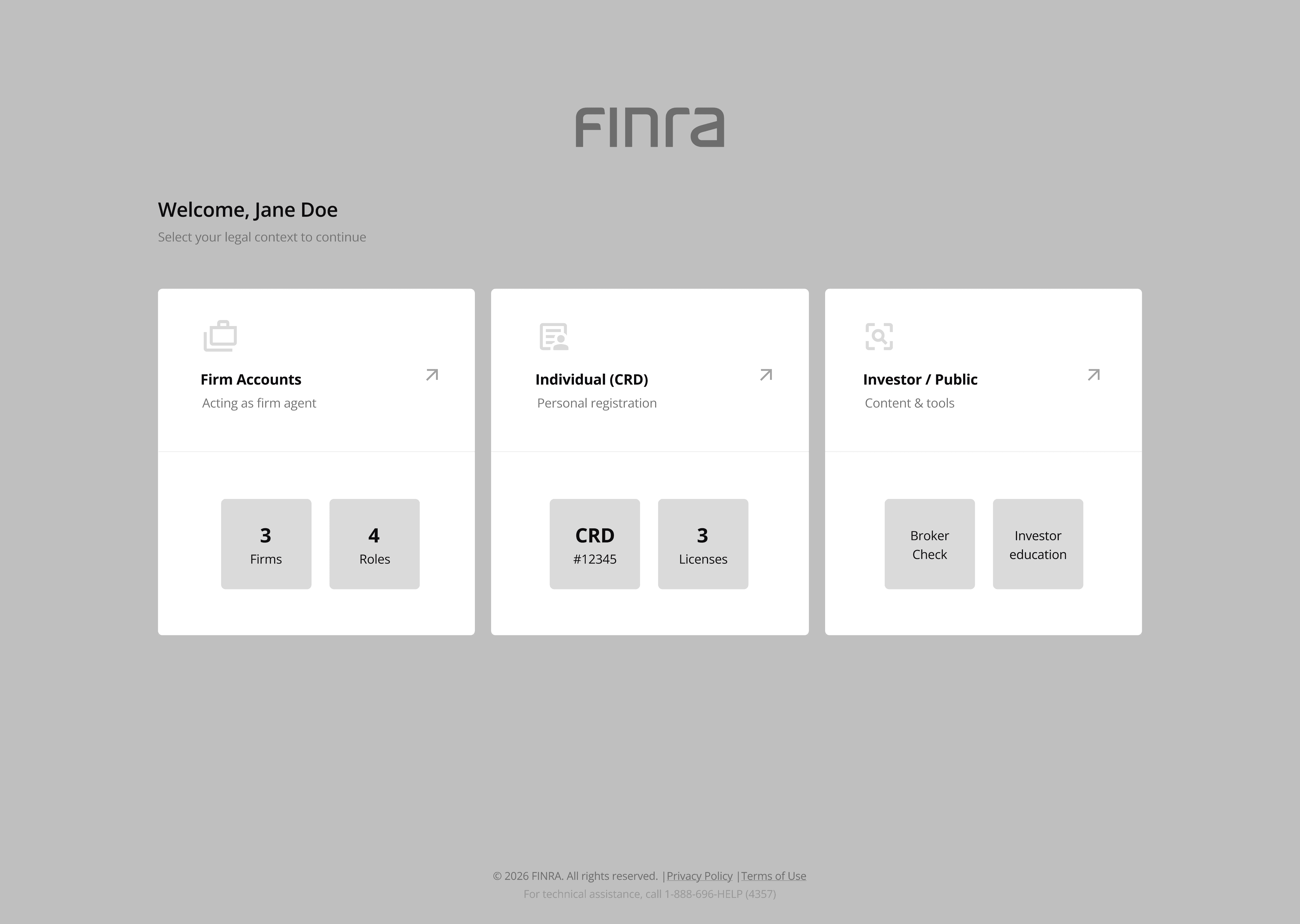
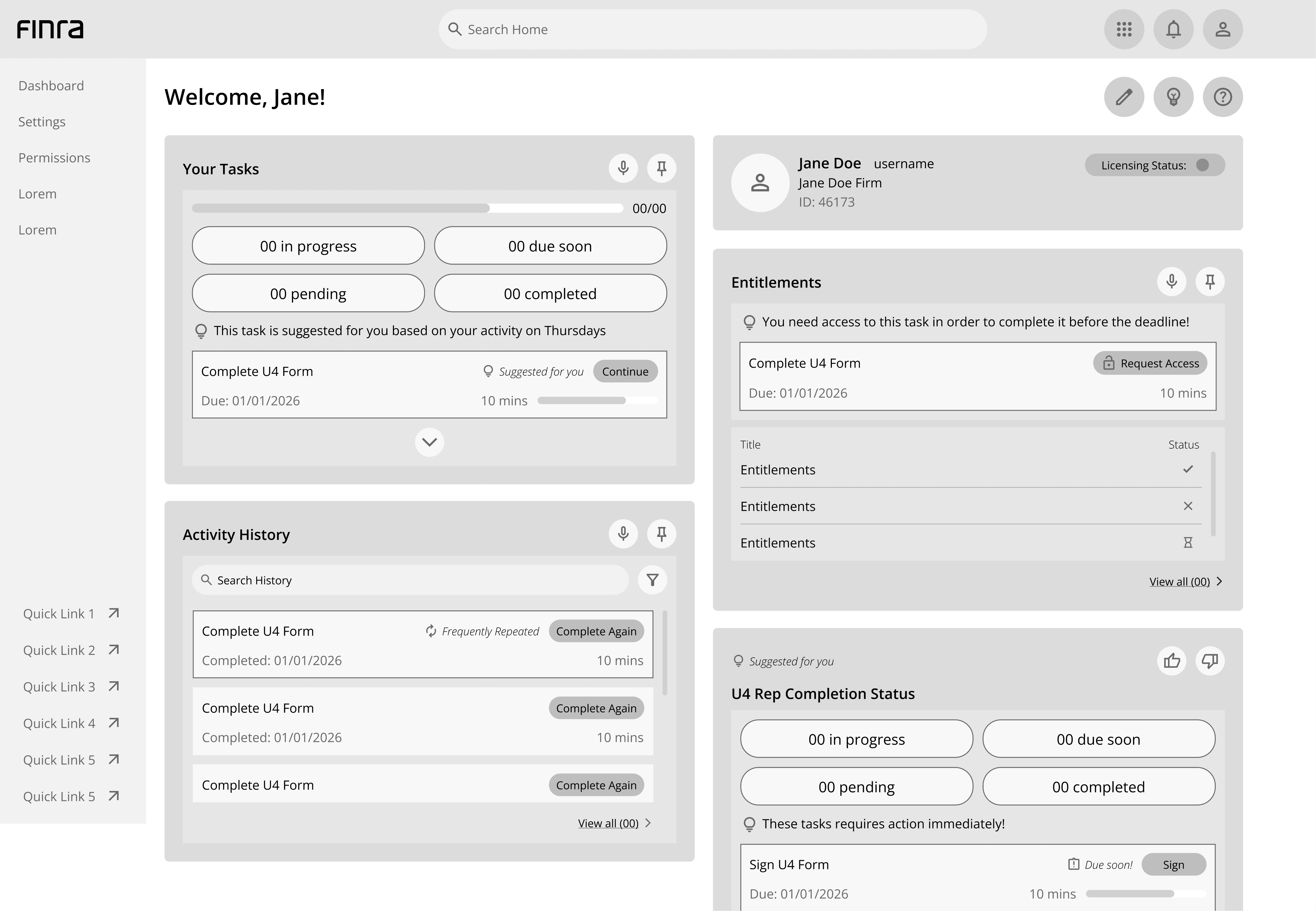
For both Login and Dashboard, we developed two distinct wireframe directions to explore different ways users might navigate FINRA's login and task management experience.
LOGIN Wireflow 1
LOGIN Wireflow 2 ⭐SELECTED

DASHBOARD Wireflow 1
DASHBOARD Wireflow 2 ⭐SELECTED

CLIENT FEEDBACK — WEEK 5
We approached our Week 5 presentation expecting detailed critique on our wireframes and design decisions. Instead, the client feedback largely validated our direction, confirming alignment with their expectations.
Login Wireframe 2 was favored for its clearer structure and more intuitive entry experience.
Dashboard Wireframe 2 was selected for better aligning with how users should navigate and prioritize information, its integrated search and live system awareness gave users faster access to what mattered most, without digging through menus.
This direction became the foundation for Iteration 2.
ITERATION 2 → REFINING THE DIRECTION
With Login Wireframe 2 and Dashboard Wireframe 2 confirmed, we refined both flows further, adding the mechanics needed to make the Lobby Concept actually work.
LOGIN


DASHBOARD

KEY REFINEMENTS
✓ Secure identity verification: a verification code confirms the right user before granting access.
✓ Simplified account selection: users pick a profile immediately after login, before reaching the dashboard.
✓ AI-powered search: moved to the global nav bar with toggleable AI mode, offering guided, step-by-step task help.
✓ Break Mode: locks the dashboard without logging out, preserving the session for sensitive data.
This direction moved into formal usability testing in Iteration 3.
A NEW CHALLENGE
Our Week 7 presentation began as a validation of our usability improvements, but it ended with a fundamental shift in the project's scope. The client pushed us to look beyond the task list itself.
HOW WE PIVOTED
The client asked us to integrate FINRA.org's content directly into the task-based workflow, transforming it from a standalone reference tool into part of a unified portal. This echoed a research insight from our SME interviews: users treated jargon as a wall, constantly leaving their task just to look up a term.
Our goal shifted from fixing one page to designing a scalable framework, one that could hold a consistent identity across FINRA's constellation of systems (FinPro, Gateway, Arbitration), not just the login and dashboard.
✓ Universal Chatbot: surfaces FINRA.org's explanations directly inside the current task.
✓ Highlight & Translate: lets users highlight unfamiliar terms for an instant, simplified definition.
✓ Redirect Pop-up: transparently notifies users before sending them to another sub-system, like the DR Portal.
This pivot became the foundation for the final prototype, tested with 18 users in the next round.
USER TESTING
After completing the conceptual design and mid-fidelity prototypes, we ran usability testing to evaluate whether the proposed solutions could actually support users through key tasks in the FINRA login experience, focusing on clarity and trust, not just completion.
METHODOLOGY
18 participants (ages 18–40) completed five realistic, task-based scenarios using a mid-fidelity prototype. A second visual variant was tested in parallel for A/B comparison.
TASKS EVALUATED
Log in using a firm account
Use AI to learn how to complete Form U4
Locate the Form U4 submission portal
View and interpret notifications
Switch between accounts
KEY FINDING
Every task reached 100% completion. But completion didn't always mean users felt confident.
Confusion clustered around moments where users had to interpret system state, account context, AI discoverability, notification ownership, and feedback during account switching. Trust concerns surfaced most at security-sensitive moments.
Takeaway: the remaining usability challenges weren't about task execution, they were about orientation, feedback, and reassurance.
Task completion
High confusion
0%
10%
20%
30%
40%
50%
60%
70%
80%
90%
100%
Log in
AI form help
Locate portal
Notifications
Switch accounts
ITERATION 3
This phase concentrated on final refinements to the login and dashboard, directly addressing where usability testing revealed friction, strengthening clarity, cohesion, and system alignment.
Before
After

✓ When user log in and their identity is verified, the user will land directly on the dashboard attached to that username.
✓ Separated AI Mode from search, testing showed users interpreted AI's placement as search-only.
✓ Removed redundant profile icon, account switching was already accessible from the profile area.
✓ Repositioned search, moved back to the main dashboard area for better visibility.
Before
After


After

✓ Expanded chatbot into a dedicated assistance view, clicking it now opens a focused space for step-by-step task guidance, instead of a small inline bubble.
✓ Quick Tasks + progress indicators, the sidebar now shows task status at a glance, and users can jump back into frequent tasks directly.
These refinements shaped the final prototype.
Before
After


After

✓ Expanded account switching into a full page, instead of a side panel, users can view all their profiles at once, addressing the confusion observed in Task 5.
After

✓ Personalized dashboard widgets, users can add or remove widgets to customize what surfaces first, giving them more control over their view.
FINAL PROTOTYPE
These refinements came together in the final prototype, a unified home for FINRA's task-based workflows and help content.
Universal Chatbot
One login, one dashboard, filings, requests, reports, and account context all in one view.


Highlight & Translate + Link Hover + Redirect Pop-up


Dashboard + Request Access

IMPACT
700+ data points synthesized into actionable insights
40% reduction in navigation complexity
100% alignment with security protocols
From ten disconnected systems to one unified home, reducing the time firms spend searching for information, and giving individual users a single, trustworthy point of entry into FINRA's regulatory ecosystem.
TAKEAWAY - SHAPING MY OWN PRACTICE
From problem to redesign
Synthesizing 700+ raw data points into a clear framework taught me how to stay grounded in ambiguity. Turning a maze of disconnected systems into one coherent experience reinforced a principle I now carry into every project: good design means the user doesn't have to think hard, they know where to go.
Branding as alignment
Working on FINRA's visual system taught me that a brand is more than a logo, it's a promise. Unifying the look across FINRA's fragmented tools wasn't just an aesthetic exercise; it was a way of telling a consistent story of trust and reliability, and of helping the broader team see their disconnected tools as one shared mission.
Design for reality
Working directly with FINRA stakeholders was a different kind of practice than a typical school project, it was a real-world consulting engagement for a major regulatory organization. I learned to present ideas to professionals, absorb direct feedback, and adjust course mid-project when the scope shifted. It taught me the difference between designing something that's interesting and designing something that's ready to be used by thousands of people, every day.